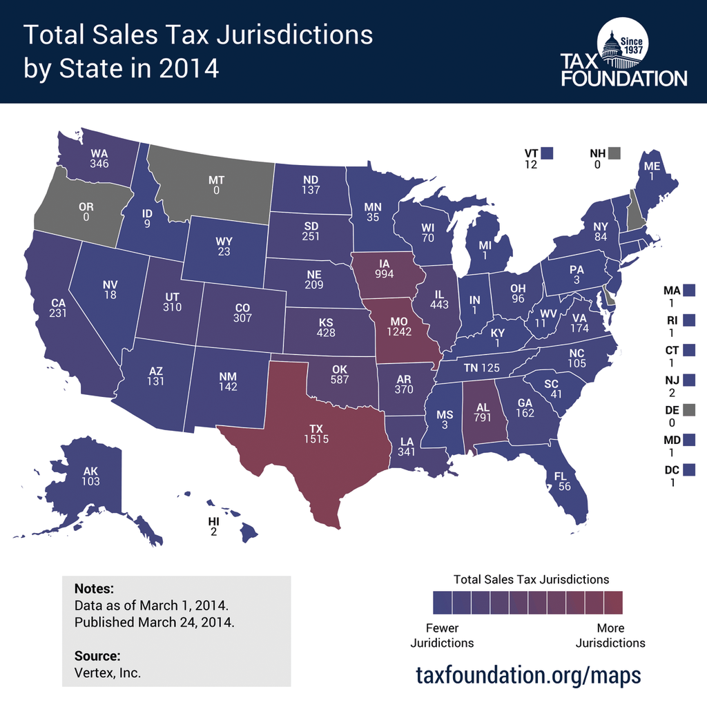
When you’re a small business dealing with sales tax, you probably don’t have a tax expert on staff to tell you what you need to do to comply. It’s up to you to figure out the correct procedures for registration, filing, and paying taxes, not to mention making sure you are collecting sales tax in the right states and charging the right rates. And because every state has different rules, you have to do that for each and every state where you have sales.
So where you do you turn? Chances are, one of the first steps you will take is looking up your state’s tax authority website to get information straight from the source.
However, when it comes to sales taxes, nothing is ever as simple as you think it should be. And that goes for trying to get the information you need online from states.
The sad truth is that for the majority of state sales tax sites, it isn’t easy to get the essential information that you need. Many of them are riddled with outdated design, perplexing navigation and unclear wording that can turn finding simple answers into a scavenger hunt.
The good
There are a few state websites that actually seem designed to help taxpayers. Some things that good sales tax websites have in common include:
- Clean design that makes it easy to see choices
- Logical navigation
- Clear, uncomplicated topic labels
- Ease of getting right to sales tax topics
- FAQs that fit on one page so that no scrolling is required
- Effective internal website search to get you right to the subject you want
- Prominent explanatory information that can be accessed before logging in to an online filing portal
We’ve put together a list of the top 5 best state sales tax websites and some of the things that make them great. Granted, this is a subjective ranking, but businesses that collect sales taxes in these states should count themselves lucky for the relative ease with which they can find the information they need.
Best 5 state sales tax websites
You can click on the dedicated sales tax section right from the Department of Revenue’s homepage. Topic tabs within that section are well-organized and clear and further links within those tabs are well-labeled and easy to navigate. Each tab has its own clear and simple FAQ section, so it is very easy to find answers.
Go to Iowa’s site, and you immediately see information for businesses separated into its own section, with clear options to click on topics such as electronic payments or due dates. The design is simple and clean, and most topics are clearly labeled so it’s easy to get right to the information you need.
The homepage offers a link directly to topics for business, and once there, the sales tax section is easy to find. The home page of the section outlines essential basics about sales tax regulations. Tabs offer options for further action such as “e-filing” and “making a payment,” while topic links to the side make it easy to see where to go for further information.
Nebraska has a separate section dedicated to sales tax. On the home page of that section, the latest sales tax rate changes are prominently posted so it’s easy to see which updates apply to you. A list of commonly sought topics makes it easy to find specific information quickly.
Texas also has a dedicated section for sales taxes. The home page of that section highlights new information and offers a prominent link to the online filing system. Topic headers are simple, logical, and easy to navigate, and pages are clean and simple.
The bad and the ugly
Unfortunately, in reviewing all 44 websites of states that have sales taxes, there were far more bad ones than good. Most were mediocre at best in terms of design, usability and functionality. The worst ones:
- Require you to hunt around and click through several pages to get to essential sales tax information
- Have so many entries on FAQ (frequently asked question) pages that’s it’s nearly impossible to find your question
- Mix information on sales tax along with other kinds of taxes so you have to wade through irrelevant information
- Require you to log in before you can get information
- Offer statutory documents rather than explaining what you need to know in brief, clear, easy-to-understand language
- Don’t support all browsers
- Have limited internal search capabilities
Continue reading online to see the worst 5 state sales tax websites.
It’s easy to get to the online filing portal from New Mexico’s taxation homepage, but difficult to find out information about the gross receipts tax (New Mexico’s tax that is similar to a sales tax). When you finally do get to the gross receipts page, the overview offers little specific information. Clicking on a link for a more detailed overview automatically downloads a 53-page document. Navigation requires a lot of going back to previous pages rather than being able to go directly to a different section. FAQs include a multitude of questions across different tax types that require scrolling through several pages to see all questions.
Florida’s sales tax section is relatively easy to get to, but once you’re there, the page is crowded with so much text that you have to wade through a lot of irrelevant information to find the topic you’re looking for. The “sales and use tax links” list topics are not clearly or logically labeled.
And when you finally do figure out how to get to the online filing system, there’s this: “This website is optimized for use on a PC using Microsoft Internet Explorer. If you are using any other web browsers, this site may not appear or function as designed. We do not officially support the Macintosh platform,” which is a huge inconvenience for a large number of users.
Go to the Arkansas homepage and sales tax is a topic under both “find a form” and “featured services” rather than one unified sales tax section. Once you get to a sales tax page, there’s a list of sales tax topics to the left. However, the center of the page features a prominent link called “Sales Tax,” which, when clicked, creates an email to the sales tax office. We wonder how many thousands of businesses have clicked on that link thinking it would actually lead them to the information they are seeking.
Most of the topics on the sales tax page lead you directly to the online filing system or actual forms without giving you any information about them or answering any common questions. The FAQ section contains nothing about sales tax, and clicking on the link labeled “Sales Tax Reference Guide” leads to a 144-page PDF. If you’re looking for a quick answer on when your due dates are, for example, you are pretty much out of luck.
The Illinois homepage is crowded and difficult to navigate, and although there is a section for businesses, it takes several clicks to get to the sales tax section. The sales tax homepage is solely long blocks of text describing sales tax in legal terms, statutory references, and links to the online filing portal. A general FAQ page does contain a section on sales tax—but it does not have all the FAQs on one page, requiring you to scroll through several pages to see all the questions.
Thanks for reading CPA Practice Advisor!
Subscribe Already registered? Log In
Need more information? Read the FAQs


